Facelift
March 3, 2008
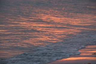
I’ve replaced the previous canned website design with my own design created around a picture I took of the surf at sunset on Sanibel Island. My goal was to create a simple and clean look based on something I did myself.
Here is what I did:
I to took the original picture and cropped it down to size for the header. Here is the original shot:

I then created the logo header (ericdaugherty.com image). I added a gradient using two colors that I picked from the header image.
I also pulled a color out of the image to use as the header text color.
I wanted to keep it clean, so I kept simple black on white for the text, and used a simple two column CSS layout.
To manage the content on the site, I briefly looked into using a CMS tool like Drupal, etc. but decided to stick with manually edited HTML due to the small number of pages and my desire of control.
I did utilize some scripting code to modularize the common HTML. I accomplished this using simple PHP include scripts that include the common HTML code on each page. I found this very clean, easy to do, and well supported by my hosting provider (GoDaddy).
For the blog pages, I use Blogger published to my hosting provider. I was able to include the PHP include calls in the Blogger template (as this just generates HTML with is copied to my web server). The only trick here was that I had to use the fully qualified path for the include files, but that was simple enough with a quick look through the GoDaddy documentation.
I also finally went back and cleaned up some of the old pages on my site that I never even updated to the previous design. So now every page here should be consistent.
I even updated my vanity favicon.ico file to match the color of the site. Just a simple E and D using the Rockwell font color matched to the header text color.
Let me know what you think and if you have any suggestions for improvement. I’m no graphics artist, but I think the new design is a good compromise between simple and unique.
